

VIDEO LIBRARY
Heat Map videos
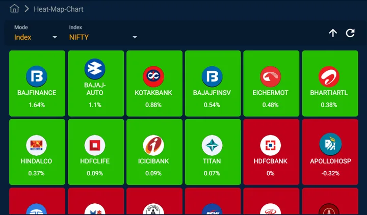
A market heat map is a visual representation of the performance of various securities and indices’ derivatives on NSE. The heat map employed color-coding to represent the performance of individual securities (Index-wise or sector-wise) on NSE derivatives segment. Typically, green indicates positive performance (such as price increase), while red signifies negative performance (such as price decrease or decline).
Sort