


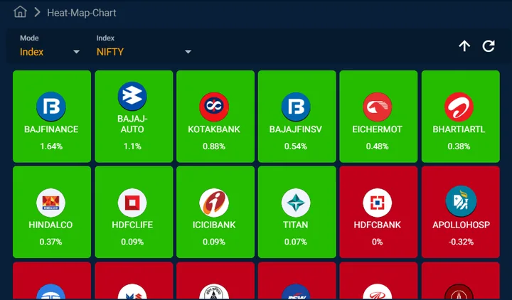
Heat Map
A market heat map is a visual representation of the performance of various securities and indices’ derivatives on NSE. The heat map employed color-coding to represent the performance of individual securities (Index-wise or sector-wise) on NSE derivatives segment. Typically, green indicates positive performance (such as price increase), while red signifies negative performance (such as price decrease or decline).
Each category is displayed separately for a holistic view of the market.
Whether making trading decisions, rebalancing portfolios, or adjusting options trading strategies on NSE, market heat maps serve as valuable decision support tools by providing a visual framework for analysis and evaluation for indices like Nifty, BankNifty etc. or individual sectors like IT, Pharma, Power etc.
What you’ll learn

Varun Shetty possesses rich experience in the field of training, he is amongst the best experts for gaining an understanding of Equity Derivatives Trading
All 124 videos by Varun →